Creating the perfect landing page for a SaaS website is hard.
The first issue is that they are complex products, and there’s a lot of information that you need to convey around them.
The second issue is that, as a general rule, there isn’t a massive amount of search volume around products or services.
So knowing what types of pages to create before you even get to what to put on them is tough enough.
That’s why we’ve created this post. To walk you through the typical landing pages you’d want to create for a SaaS website and give you some examples of what should be included on them.
In this post, we’re going to cover the following:
- Why landing pages for a SaaS website are different.
- The 5 types of landing pages every SaaS site should have.
- Examples of best-in-class landing pages & why they work.
So once you’re finished with it, you should be able to create a site that is built to capture traffic and convert.
Why Landing Pages For A Saas Website Are Different
SaaS products usually exist because they’ve:
- Spotted a problem that no one else has solved.
- They are a niche solution for a specific segment or industry.
All of this means that it typically has a few use cases for it, and of those use cases, there isn’t much search volume for them.
So basically, you’re not going to have loads of landing pages on your site.
Instead, you’ll have a few key pages to get across all the features, use cases and key selling points of the product.
The 5 Types Of Landing Pages Every SaaS Site Should Have
When looking at best-in-class SaaS sites, their SEO-focused landing pages typically fall into five categories.
Feature Pages
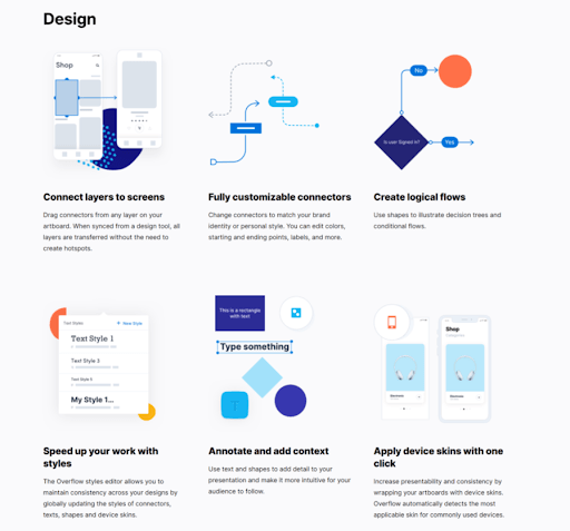
Landing pages that are built to talk specifically about the individual features of your service/tool.
They are often used to specify the unique selling points of the service and can be beneficial for both organic traffic acquisition and lead generation.
Solution Pages
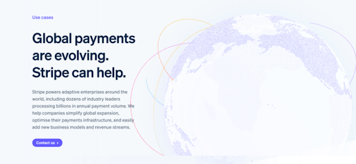
These pages can be an excellent way for SaaS sites to generate traffic and leads, especially if you are in a niche where you’re the only site in the market offering this solution.
These pages are there to capture traffic from users who are in the awareness stage of their journey. They target the problems that the tool is specifically solving and sells it as the solution.
Job Role Landing Pages
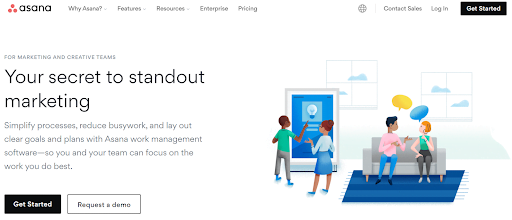
Job Role landing pages are the perfect way to target specific personas that use the tool.
They’re an easy way to highlight all of the pain points they have and how your product solves them, making them super targeted and relevant.
Enterprise & SMB Pages
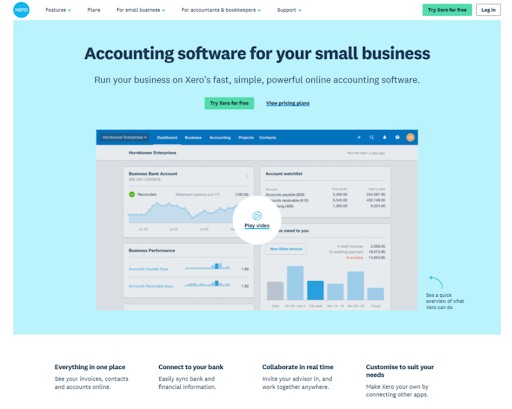
These pages act similarly to ‘by role’ pages, except they focus more on breaking down the features and benefits for businesses at different scales.
Think of it this way, a small business with low overheads looking to complete a basic tax return isn’t going to need the same advanced accounting software as an enterprise-size business, so their search and requirements will be different.
These pages can be valuable for generating leads, as the information is tailored specifically to the user.
Comparison Pages
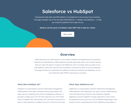
Comparison pages are another type of landing page that’s effective for generating organic traffic. We know that searches involving service comparisons tend to generate a good amount of organic traffic, especially as a site grows. This can be seen from sites such as G2 & Capterra, which generate a considerable amount of organic traffic by aggregating these types of sites.
Users searching for comparisons between services are also far more likely to be further down the conversion funnel than others. They already know what they’re looking for and are just trying to decide which service is best for them.
By creating landing pages around these types of searches, you have the ability to show users why your service is more valuable than your competitors.
The Anatomy Of Perfect SaaS Landing Pages And Examples Of Them
Designing a landing page for a SaaS site is not simple. It requires strong UX, an understanding of user pain points and strategic placement of the correct information throughout the page.
Whilst this can be daunting and & sounds like an impossible task, don’t worry! We’ve pulled together some basic templates that will give you a starting point from which you can play around and test what works for you.
Feature Page Template
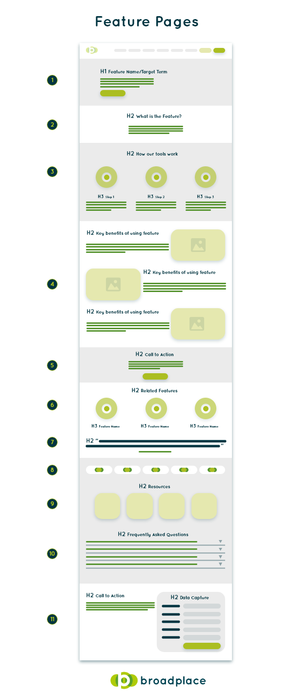
What to Include in a SaaS Feature Page
1.Title / Introduction
The title and introduction section of a SaaS feature page should give users an understanding of exactly what the feature is at a glance. The exact title and intro that you should use within this section will depend on your target term, but it is important to include the keyword within both sections.
This section is also a great place to include your main call-to-action above the fold to try and drive users to convert.
2. What Is The Feature
Within this section, the user should be given an explanation of what the feature is and also an introduction to the tools benefits.
It needs to be written in a way that if they only read this section they could clearly answer what the tool does and it’s key benefit.
3.How The Tool Works
This section should be dedicated to giving users, in simple terms, exactly how your tool works when carrying out this feature.
It needs to answer questions like:
- Do you have to connect the tool to a CRM?
- Is there a manual process that the user needs to do?
By detailing this in as simple way as possible, users are more likely to understand your tool immediately.
4. Key Benefits
A section dedicated to explaining the key benefits of your tool. This can be the benefits vs a manual process, but it can also be a way of highlighting the tool’s unique selling points vs the competition.
This is the key area where you can really sell the tool.
5. Mid-Page Call-To-Action
The user should now have an understanding of what your feature does, how it does it and also the key benefits that it offers. They may have all of the information they need to convert, so offering them a mid-page call-to-action is important to try to drive them into the funnel.
6. Related Features
Links to other features that your tool has that the user may find interesting. This not only gives them other examples of the variety of uses your tool has, but also improves internal linking to key landing pages.
7. User Testimonials / Reviews
Now that a user knows about your tool, this is a great place to add any positive feedback and reviews that your tool has received. This will help to establish trust with the user if they are unsure if they are willing to convert.
8. Who Uses The Tool
This section is another trust indicator for the user. Highlighting the companies that use the tool by showing their logos can be great for establishing credibility with the user, especially if your tool is used by well known players within your market.
9. Resources
Now that we have given users everything they need to know about this feature, it is a good time to offer any additional resources that you may have created that relate to this topic. This can include blog content, industry reports, templates etc. the key thing is adding additional value to the user and cementing your place as a thought leader within your market.
10. Frequently Asked Questions
An FAQ section can be a great way to offer some quick additional value and also potentially save time for your sales teams. If you know users often have questions related to this feature, offer them a direct solution on the landing page.
11. Call-To-Action
The last element on the page is your more detailed CTA. It can often be good to give a wrapup of the specific page before leading with the key messaging.
Solution Page Template
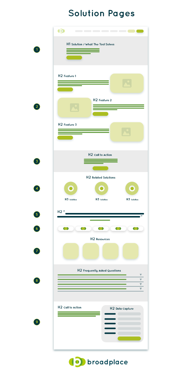
What to Include in a SaaS Solution Page
1. Title / Introduction
The title and introduction section of a SaaS solution page details the exact solution that your tool is offering for users. The title and intro you should use within this section will depend on your target term, but it is important to include the keyword within both sections.
This section is also a great place to include your main call-to-action above the fold so that users can easily convert when landing on this page.
2. Main Features Of The Tool
This section is where you’ll need to list the features that your tool offers that solve the user’s problem.
This is often done in by adding tailored copy that details how the feature solves the specific issue, as well as any supporting imagery that you can provide with a link to the specific feature page.
3. Mid-Page Call-To-Action
Now that the user understands how your tool can solve their problem, they may have all of the information they need to convert.
So offering them a mid-page call-to-action can help to drive them into the funnel.
4. Related Solutions
Links to other solutions that your tool has that the user may find interesting.
This not only gives them other examples of the variety of uses your tool has, but also improves internal linking to key landing pages.
5. User Testimonials / Reviews
Now that a user knows about your tool, this is a great place to add any positive feedback and reviews that your tool has received.
This will help to establish trust with the user if they are still unsure about testing the product out.
6. Who Uses The Tool
This section is another trust indicator for the user.
Highlighting the companies that use the tool by showing their logos can be great for establishing credibility, especially if well-known players within your market use your tool.
7. Resources
Now is a good time to offer any additional resources that you may have created that relate to this topic.
This can include blog content, industry reports, templates etc. the key thing is adding additional value to the user and cementing your place as a thought leader within your market.
8. Frequently Asked Questions
An FAQ section can be a great way to offer some quick additional value, and also potentially save time for your sales teams.
If you know users often have questions related to this feature, offer them a direct solution on the landing page.
9. Call-To-Action
The last element on the page is your more detailed CTA. It can often be good to give a wrapup of the specific page before leading with the key messaging.
Hub Pages Template
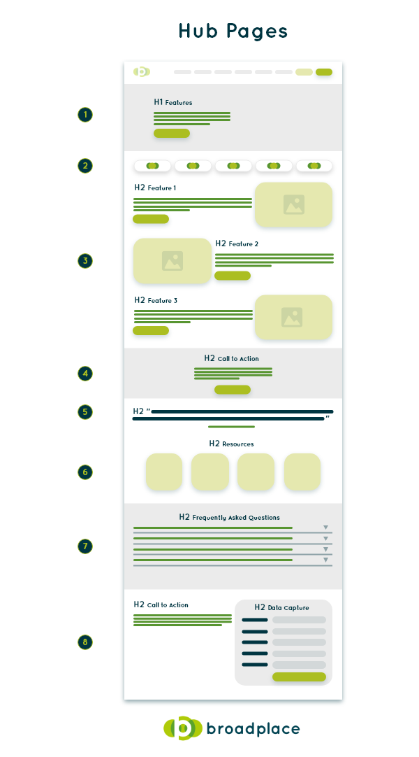
What to Include in a SaaS Hub Page
1. Title / Introduction
The title and introduction for hub pages should simply explain to users what the tool does overall.
In terms of targeting, these pages can be fairly generic with the tool name plus the type of pages featured within the hub, i.e. Photoshop features or Hubspot Solutions.
2. Who Uses The Tool
This section is a trust indicator for the user.
Highlighting the companies that use the tool by showing their logos can be great for establishing more authority with the user, especially if your tool is used by well-known players within your market.
3. Features Pages
This is the main section for hub pages, where you link to the relevant pages that you want the user to navigate to.
The two types of pages that are normally linked to are feature and solution pages.
You want to give users a brief snapshot within the copy of why they should be interested in the feature or solution, they can then navigate to the relevant page to gain more information.
4. Mid-Page Call-To-Action
Every page should be trying to drive users into the funnel. Even if it’s a navigational page like this.
So don’t neglect a middle CTA on the page, even if it doesn’t feel right.
5. User Testimonials / Reviews
Any positive feedback and reviews your tool has received can add trust with the user if they are unsure if they are willing to convert.
6. Resources
Now is a good time to offer any additional resources you have created that relate to your tool.
This can include blog content, industry reports, templates etc. the key thing is adding additional value to the user and cementing your place as a thought leader within your market.
7. Frequently Asked Questions
An FAQ section can be a great way to offer some quick additional value, and also potentially save time for your sales teams.
If you know users often have questions related to this feature, offer them a direct solution on the landing page.
8. Call-To-Action
The last element on the page is your more detailed CTA. It can often be good to give a wrap-up of the specific page before leading with the key messaging.
Job Role Page Template
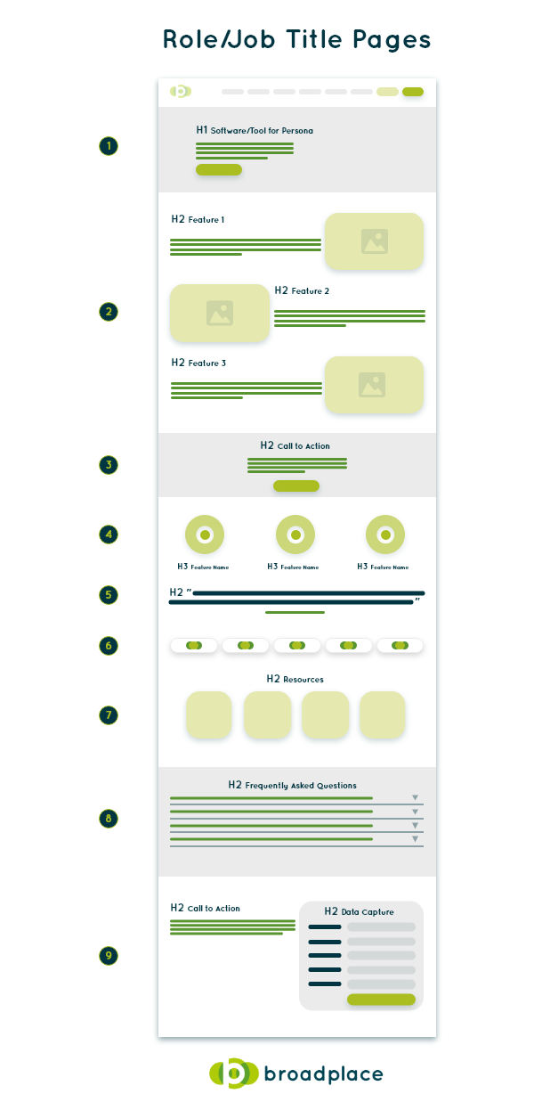
What to Include in a SaaS Job Role Page
1. Title / Introduction
The title and introduction for role pages should give users an explanation of why this tool will make their job easier. It should highlight the main feature/solution that applies to them and be clear about the benefit.
In terms of targeting, these pages can be specific with the key use case for the role i.e. Sales Enablement Tool For Business Development Managers.
2. Features/Solutions For The Persona
This section is where you’ll need to list the features or solutions that your tool offers for that specific persona/job role.
This is often done in by adding tailored copy, as well as any supporting imagery that you can provide with a link to the specific page.
3. Mid-Page Call-To-Action
You never want a user to have to scroll too far before they see your main CTAs. So offering them a mid-page call-to-action is important.
4. Related Personas
A section where you can offer the user links to other related job role pages.
It’s good for showing the breadth of use cases for your tool but it’s also useful because sometimes if a tool has a wider impact outside of a specific job function it can be easier to get the sign-off for using it.
It’s also key for interlinking for SEO purposes.
5. User Testimonials / Reviews
Any positive feedback and reviews your tool has received can add trust with the user if they are unsure if they are willing to convert.
6. Who Uses The Tool
This section is another trust indicator for the user. Highlighting the companies that use the tool by showing their logos can be great for establishing more credibility, especially if your tool is used by well-known players within your market.
7. Resources
Now is a good time to offer any additional resources that you may have created that relate to this topic.
This can include blog content, industry reports, templates etc. the key thing is adding additional value to the user and cementing your place as a thought leader within your market.
8. Frequently Asked Questions
An FAQ section can be a great way to offer some quick additional value and also potentially save time for your sales teams.
If you know users often have questions related to this feature, offer them a direct solution on the landing page.
9. Call-To-Action
The last element on the page is your more detailed CTA. It can often be good to give a wrapup of the specific page before leading with the key messaging.
Enterprise & SMB Page Template
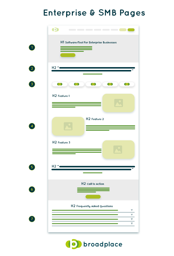
What to Include in a SaaS SMB/Enterprise Page
1. Title / Introduction
The title and introduction for role pages should give users an explanation of why their company type should be interested in the tool.
In terms of targeting, these pages can be specific with the key use case for the role i.e. Accounting Software For Enterprise Business.
2. User Testimonials / Reviews
Trust indicators are often more important for this type of search, so any positive feedback and reviews your tool has received can add trust with the user if they are unsure if they are willing to convert.
3. Who Uses The Tool
This section is another trust indicator to the user. Highlighting the companies that use the tool by showing their logos can be great to establish more authority with the user, especially if well-known players within your market use your tool.
4. How The Tool Helps The Business
This section is where you’ll need to list the features or solutions that your tool offers that can help the specific company type that you are targeting.
This is often done in by adding tailored copy, as well as any supporting imagery that you can provide with a link to the specific page.
5. Additional User Testimonials / Reviews
Adding an additional section for reviews or testimonials can help to reconfirm trust with the user before the page’s call-to-action.
6. Call-To-Action
This is where you can add a detailed call-to-action on the page, where you can add a wrap-up of how the tool can help the specific business type before giving a unique CTA.
7. Frequently Asked Questions
An FAQ section can be a great way to offer some quick additional value and also potentially save time for your sales teams.
Comparison Page Template
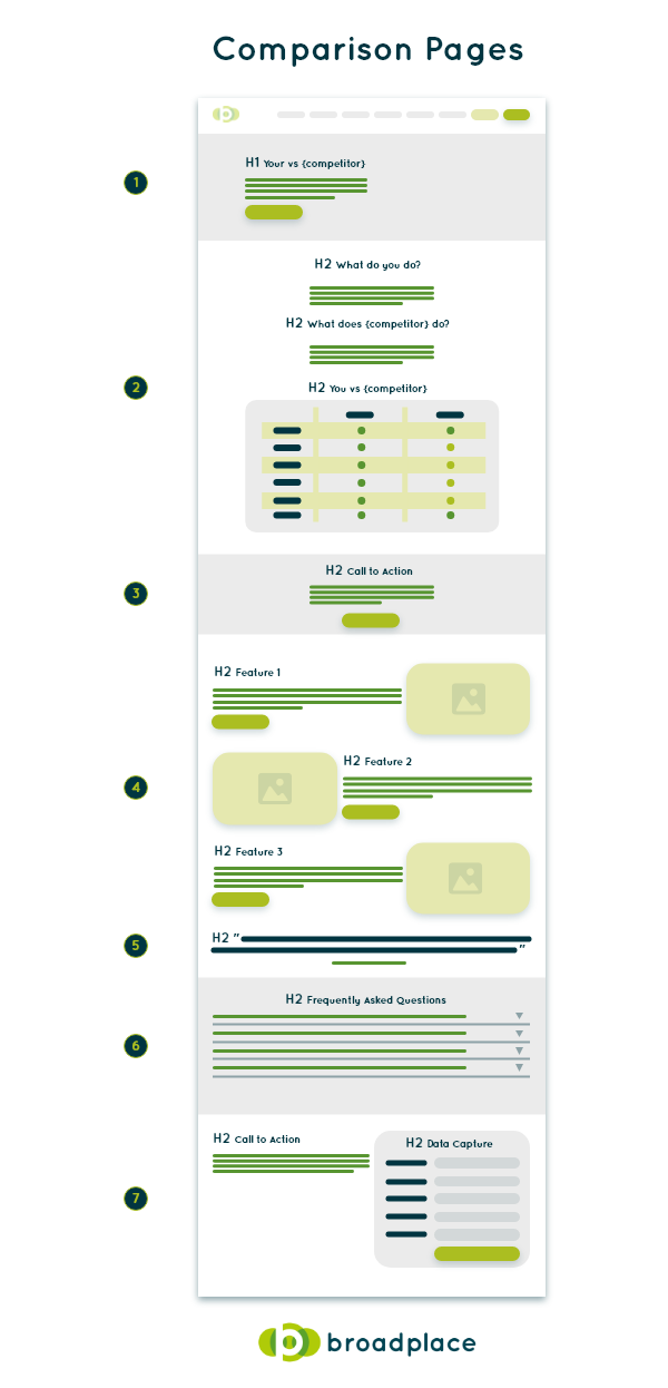
What to Include in a SaaS Comparison Page
1. Title / Introduction
The title and introduction for comparison pages are fairly straightforward. Users are looking for a comparison of your tool and a competitor, so the copy and targeting should reflect that.
2. You vs Competitor
This is the key section for this type of page.
You need to give users an understanding of what your tool does, what your competitor does and the key differences between them.
You can do this in many ways, but a good way to give a top-level view is to showcase your tool’s USPs within a table vs the competitor.
However, it is important not to be too biased as users can often spot this and are less likely to trust the information.
3. Mid-Page Call-To-Action
After the comparison table, the user may be ready to trial or convert. So it’s important to have a strong CTA in the middle of the page.
4. Benefits Of Your Tool
This is a section where you can break down the individual features and solutions that your tool offers vs the competition and the benefits each has.
5. User Testimonials / Reviews
Trust indicators are often more important for this type of search, so any positive feedback and reviews your tool has received can add trust with the user if they are unsure if they are willing to convert.
6. Frequently Asked Questions
An FAQ section can be a great way to offer some quick additional value and also potentially save time for your sales teams.
7. Call-To-Action
This is where you can add a detailed call-to-action on the page, a wrap-up of how the tool can help the specific business type before giving a unique CTA.
Summary
Creating landing pages for a SaaS site to generate organic traffic is difficult, as most SaaSs struggle to maintain a consistent amount of traffic over time.
This leads to most of them becoming heavily reliant on paid traffic, which is unsustainable in the long run. Most SaaS sites receive the majority of their organic traffic from blog content, but this can often be less relevant traffic that is less likely to convert.
By creating landing pages that are targeted towards SEO, sites are more likely to get high-quality, sustainable traffic that can last for months or even years moving forward.
Most pages that SaaS sites create that target organic traffic falls into one of the 5-page types:
- Feature
- Solution
- Persona
- Business Size
- Comparison
It’s also important to think about the elements that are included on those landing pages. By creating content that is a mixture of:
- Informative
- Conversion-focused
- Highly targetted
- Relevant to users
Your site can generate a huge amount of online traffic and free conversions.
