When it comes to advertising everyone has their own opinions on what is more valuable. From data to targeting, to optimization to creative – every marketer will have an opinion on what’s more important based on their experience.
The real truth is that every single aspect feeds into a successful marketing strategy and without one the whole campaign will not succeed.
Now it’s easier to find best practices for optimization and data gathering as they are subjects that are talked about very frequently, but something I have found a lot harder to find is best practice guidance for creative. Especially on Facebook.
But why is nailing your Facebook creative important?
The creative is the first point of call for a successful Facebook ads campaign. You can be the best Facebook marketer and know all the optimization tips and tricks but without strong, engaging imagery and copy you’ll find that you just fall short.
Your creative is what draws users to your brand and if you are not following these best practices you’re probably doing it wrong.
So in this post, we will break down the 5 Facebook creative best practices to ensure your business will succeed on the platform.
1. A/B Testing Creatives
To begin our list of top tips for Facebook creative we have A/B testing. This may seem obvious, but it is surprising how many businesses don’t test which creative actually works best for them.
Instead, they just run with the same combination of creative and copy and never stray away from what they are currently doing.
By doing this you are potentially limiting yourself without realising.
By constantly A/B testing you can ensure you are not missing out on any potential conversions by regularly testing new ads, copy, or new and updated creative.
A successful Facebook marketer regularly tests different creative types, from images to videos as well as carousels and collections to see what delivers on their objectives in the most cost-effective manner.
It’s worth noting that you should only test one variable at a time to avoid confusion in what elements are driving change in performance. You can test either, creatives, headlines or CTAs to identify the best combinations of creative and messaging to generate results specific to your objectives.
This is a great way to optimise as you can take the data generated by your existing activity and testing and apply it to changes in messaging and creatives to help better meet your target customers needs.
2. Choosing the right images
How many times have you been scrolling through your feed and come across an ad and almost laughed at how obvious the use of stock imagery is?
There is nothing worse than coming across an ad that uses blatant stock imagery as it just looks lazy and slightly detached from the brand itself.
Choosing the right imagery is essential in constructing a strong creative for delivering results. It is not always easy to come up with your own images but take the time if you do use stock imagery to avoid generic-looking and downright cheesy imagery.
Take this as an example, what do you think is likely to generate better results for a dental practice trying to generate leads:

There is a clear difference between the two stock images.
Image A feels very unnatural and staged and let’s be honest, you’ve probably seen it 1,000 times before. It doesn’t show off the product, and it’s hard to tell what the work being carried out is and what the benefits to potential customers are.
Whereas image B offers a high-resolution image focusing on the specific treatment and has the product (braces) as the pinnacle point of the image. This shows the users what’s on offer and you can instantly recognise what the product is and the benefits.
Here are some of our favourite resources for high-quality stock imagery that you can use today for free for your Facebook creative:
It is also essential to think about the quality and sizes of the images you are using. Try to use the highest quality images that you can. This ad could be the first time a user has an interaction with your brand and you don’t want their first impression of you to be one of cheap or low quality, as using low-resolution images will certainly have this effect.
Choosing the right size of image is also important. Facebook favours larger image sizes which are great for increasing the quality of your ads. The recommended ad sizes for Facebook creative are:
Facebook Ad Image Size:
- 1,200 x 628
Facebook and Instagram Stories Size:
- 1080 x 1,920
Additional Creative Information:
- Supported File Types: jpg, png
- Image Ratio: 16:9 to 9:16
- Amount of Text Allowed on Image: 20%
By using high-quality images in a variety of different formats and the recommended sizes you are telling users from the off, this is my brand or product and its quality. This may seem minor but it is a huge thing, especially on Social Media platforms like Facebook and Instagram where visuals are everything.
3. Keep Text To A Minimum
Another top tip of ours is to keep the text on your creative to a minimum. Whether it’s a static image or video, it’s so easy to get carried away with flashy USPs and quirky calls to action. In reality, these aren’t going to drive the results you think they will, they just crowd the space and often scare off users.
It’s also no secret that people on Facebook and Instagram scan quickly. We are becoming more and more greedy on social media without realising it. We are constantly trying to consume more and more and as a result, the time we spend dwelling on a post is only dwindling more as time goes on.
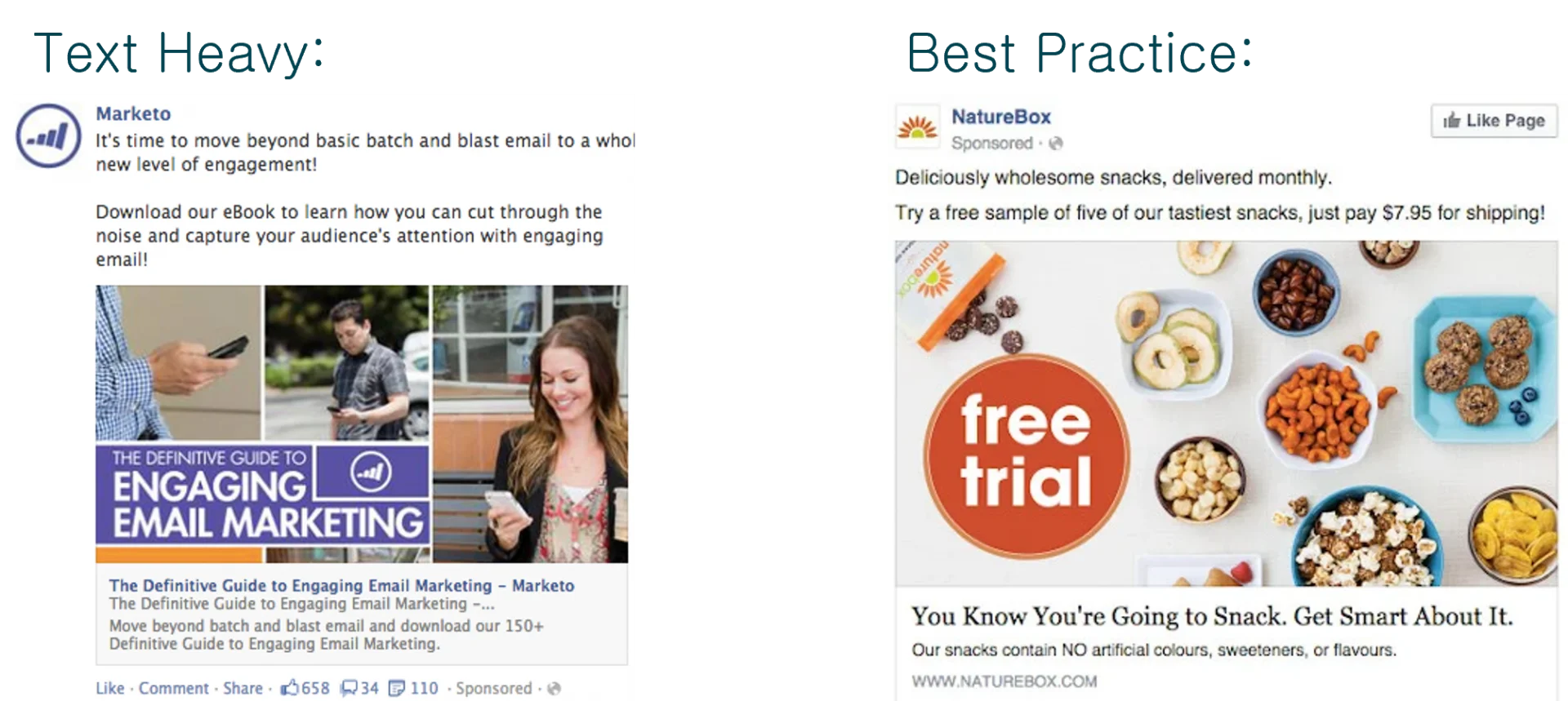
As a result, overcrowding creative with text for the user to read is the easiest way to lose their attention and get poor conversion and click through rates. Take these two examples below you can instantly see there’s a clear difference and it’s not hard to tell what’s going to convert better:

So it’s key to nail strong messaging that you want to communicate and keep it short and sweet.
It’s easy to draw up lots of catchy headlines that you want to throw in but try your best to avoid doing this. There is also nothing that is stopping you from creating multiple variations of creative and A/B testing as we mentioned earlier to identify the best text on your ads based on your KPIs.
You can always go into more detail in the description and primary text of your ad to get across longer form messaging if you feel you need to.
4. Test Different Content Types
Something else to bear in mind when drawing up plans for Facebook creative is using different content types.
If you have the resources internally, why limit yourself to static imagery when you can use videos, gifs and a whole host of other visual formats that Facebook has at its disposal:


By testing different products and using different visual signs you can find what ads deliver the best results for you and begin your journey to Facebook success.
Dont just stop there, you can also be dynamic. If you have creative in different sizes and orientations you can rotate ads across different parts of the platform. You can use story ads with vertical creative and generic feed ads with your typical more rectangular imagery.
The point of creative is to be creative. Your options are only limited by your imagination. You can have fun with it, play around with it You don’t have to limit yourself. You have the opportunity to utilize so many different ad formats so why not take advantage of them.
In essence, you don’t have to limit yourself, so why do it. Play around with rotations, sizes and formats and get creative with your creative.
5. Align Ads To Your Objectives
To wrap up with our final point and arguably the most crucial point of all…
It is essential to align your ads and specifically your creative to your objectives!
It’s easy to get carried away with flashy visuals but if they are not aligned to your objectives they will fall short at the first hurdle.
If you have identified an objective of shifting stock and focusing on sales and the return on that advertising investment, then your ads and creative need to be more product-driven.
In this instance optimising your creative to include your product specifically is the way to go. Avoid things like storytelling and focus on your products’ USPs.
Likewise, if your objective is to generate brand awareness and build an image for your business online then focus on the brand itself. Use things like customer testimonials, visual ads around the business and blogs are the way to go in expressing your values and what you offer within your space.
This will allow you to grow your brand and get people talking helping you go out there in the world. This can work for startups and also established businesses looking to explore new markets or just generate some traction in their market.
Similarly to paid search or other digital marketing, there are different ways to optimise for specific objectives and this is no different with creative. The first point of call in a briefing stage to a designer is to focus on your objectives and what elements you need to include in your creative to ensure those goals are met and can be.
In Summary
And that’s it, that concludes the list of our top Facebook creative best practices for delivering results across e-commerce and lead generation businesses. By using these top tips you’ll be able to generate successful returns thanks to your engaging eye-catching creative.
Remember creativity is crucial to successful creative, it’s literally in the name. Ensure your creative meets the purpose of your objectives, is eye-catching, high quality and shows what you are offering and you’ll be just fine.
So what are you waiting for, go out there and be creative today!

